

How might we universally convey information about bus delay?
the Bus Beacon
Group Project
User Research
End-to-end Process
User Testing
2023
SKIP THE READING
Watch a video
ORIGINAL
RESEARCH QUESTION
(refined later)
How might the public transit commuting experience be improved for students new to Seattle?
Presumption: There’s a sustainability angle here
SURVEY DESIGN
A really simple tear-apart poster to indicate if there even exists a problem with the commuting experience. (“How was the bus today?” Bad / Okay / Great)
But also created a slightly deeper survey to gain insights about people’s commute around campus. We made it a point to section it well, and have
all questions made optional.

Sticking posters at bus stops also helped us start insightful conversations with commuters!
SENSE MAKING
FLY ON THE WALL
CONTEXTUAL ENQUIRY
Since our scope was huge, we started with taking many bus rides.
We would talk to people at the bus stand, or observe them from a distance trying to understand:

why do / don’t people take the bus more?

AFFINITY MAPPING
Mixed with our insights from the survey,
we did some affinity mapping


It turned out,
People don’t care *that* much
about sustainability
Most important areas of concern for people were:

(from 74 respondents)
And it wasn’t about people’s preferences alone, but also about where they come from
SECONDARY RESEARCH


USER PERSONAS
(also from primary research)
We bucketed people based on their top commuting priority
did they want to travel cheap? reliably? conveniently?
*Persona images generated on mid-journey


NARROWING SCOPE
+ IDEATING
And 3 key (doable) directions emerged
Information dispatch
Safety
Route Planning

Since we can’t magically make buses more frequent / faster / reliable
before we realized:
information dispatch was key to better route planning and safety too!
Information dispatch
Safety
Route Planning
REVISED DESIGN QUESTION:
How might we better convey information about bus delay to routine commuters in Seattle?

We decided to do a follow-up survey around ‘information’
and it revealed people’s preferences around receiving information
too many notifications, too many tools
users would rather ‘pull’ information than have it ‘pushed’ onto themmost preferred methods of communication
Live update map  (76.9%)
Information displayed at the bus stop (61%)
location-based notifications (54%)
DESIGN GOALS
Not everyone uses a smartphone. But also, our follow-up survey showed it’s annoying to keep pulling out one’s phone - especially when it is raining in Seattle - to repeatedly check the delay of a bus on an app.
Shouldn’t need a smartphone
It should cater to diverse needs, and not keep anyone in an uncertain state. Should have alternative visual, sensory, and auditory mediums
Accessibility centered
It should communicate across cultural barriers like language and signage understanding, being friendly to immigrants, tourists and locals alike
Universally intuitive
DESIGN
The Bus Beacon


KEY FEATURES
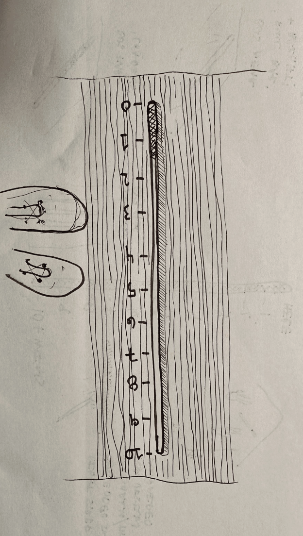
using the bus pole as a ‘loading bar’ for bus arrival
‘Rising’ up to completion is a globally understood notion and has mostly positive connotations.

There is also a little illuminated ‘ring’ at the top that indicates where the ‘rise’ is going and provides a reference for how much time is left from across the street, apart from other visual markings that can seen 
a refreshable braille display

sound chime 20s before arrival

inspired by Tokyo train jingles
Preference for both visual countdown cue (dotted line circle) and HH:MM time format
Desire for ‘hash marks’ of time and consist scale of time increments
Clarity of upcoming result when scanning the QR code
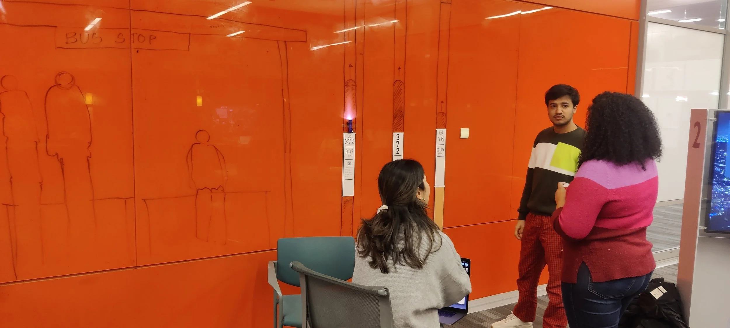
we used a 1:1 scale paper prototype of different display options
Held in rapid succession, five participants were given a scenario and asked to walk through their thought process.

COGNITIVE WALKTHROUGH
USABILITY TESTING

We showcased the final prototype of
The Bus Beacon

…and also made an add-on widget
to see one’s most frequented bus routes at a glance,
based on the same design language as the pole
FINAL PROTOTYPE


using colour coding for routes


QR code for additional info


and made some learnings:


Some more iterations and cardboard rolls later,


REFLECTIONS

The service vs product binary
I wondered how strictly were we doing ‘product design’ by re-designing the bus stop. I realise that all products fall into a larger service ecosystem and the binary shouldn’t be thought about too seriously.
Reverse skeuomorphism?
Our bus pole was inspired by the ‘loading bar’. I’ve heard of digital artifacts imitating real-life counterparts, but I’m learning that the reverse can also happen in a digitally-aware age.
Pivot!
We pivoted away from our initial interest around sustainability when we realized it wasn’t our user’s priority and that’s so okay! Design is about truth-seeking and we can only own good questions.