
Boosting engagement through Suggestions

Summer Internship
Intuit, Mountain View, CA
TEAM
Staff Product Designer
Product Design Intern (me)
Sr Product Designer
Product Manager
Engineering: Development Lead
Engineering: AI Lead
+ Dev team of 6
SCOPE OF IMPACT
40M+ Weekly Search Queries
60% of weekly active users
on Quickbooks Online
Total Users: 6 Million+
TIMELINE
First Ship: 3 Months
Ideal state shipping: 6 months
Pushing Suggestions and Upsells in Search drives revenue but diminishes Search Experience.
Too many feel like ‘ads’. We had to strike a balance and think for scale.
Lots of alignment with PM + Engineering.
Our shipped design considered:
High relevancy
Focusing on ‘action’-oriented suggestions
Describing frameworks for # of suggestions
SKIP THE READING
CONTEXT
QuickBooks is a financial management software that helps over 7M+ small businesses streamline accounting, payments, payroll, etc
The Quickbooks Global Search allows customers to quickly look into their transactions, contacts, and records
THE BIG PICTURE
1 / Move away from a keyword-based search
In the Intelligence age, querying in natural language is the bar
2 / Company-wide focus on AI
Quickbooks starting asking:
How can we create more ‘done for you’ jobs?

3 Key Business and Technical developments happened within Search at Intuit:
3 / Introduction of Full-page Search Results
Quickbooks decided to introduce Full-page Search results,
which opened up fresh real-estate for results, recommendations, upsells, etc.

THE ASK
Drive more user ‘action’ in Search to help them discover more of Quickbooks
BUSINESS TRANSLATION
Capitalise on new technical capabilities to
boost engagement and upselling through suggestions
FREE-FORM RESEARCH


I went around San Jose markets and clicked pictures of good suggestive experiences in-real-life, while also doing an audit of good “suggestions” online


So I proceeded to think through:
What makes a good suggestion?
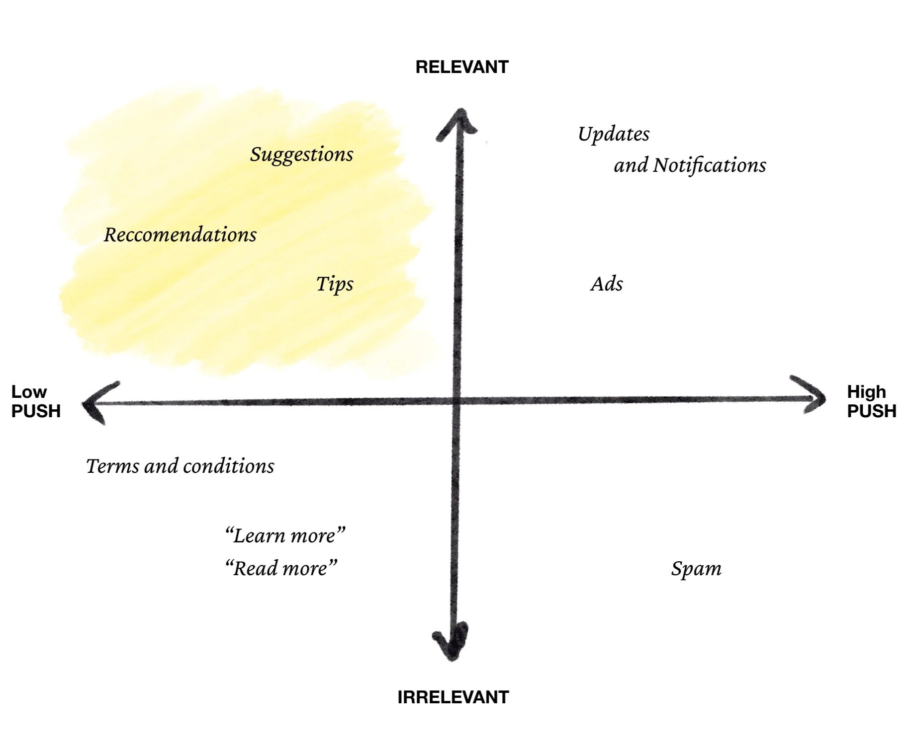
AHA !
It turns out,
A suggestion is only a “suggestion” if it’s relevant and not pushed too hard.
Much else is an “ad” (we hate ads — they’re annoying)
EMERGING FIRST PRINCIPLES
So with some push-back from PM,
we advocated for some key decisions:
Suggest, but don’t be pushy
More upsells doesn’t always mean more revenue.
Our users already pay a premium to use Quickbooks, and cannot be upsold to at every opportunity.Never get in the way of results
The Search dropdown has limited real estate.
Accountants hate it when things come in between them and the numbers they’re looking for. Obstructing that will raise VOC (voice of customer) complaints.So when the PM pushed for recommendations to be on the top of the dropdown, we pushed back.
Wait for the ML-models to catch up
Relevancy of Suggestions is key.
Till the ML model driving suggestions has learned and trained significantly,
we limit the number of places where these suggestions appear
ALIGN, ALIGN, ALIGN
These decisions required a lot of alignment work;
And rounds and rounds of presenting at design crits


DESIGN
Form Explorations

“will this scale as our suggestion scope grows?”
“is this too similar to the shortcut icons we use on the dashboard?
“can this be developed in time for v1 release?
EARLY CONCEPT FOR ALIGNMENT

“does this form support enough text length across other languages?”
“will we need more buy-in from design systems for this?


We aligned on using cards as the visual element.
This made sense since:
We wanted to limit # of suggestions shown
Lend the suggestions enough visual cue for new (often overwhelmed) customers to notice and feel guided
Unlike chips, they could easily take up space across various real-estates on the platform

ANATOMY OF A CARD

DESIGN HIGHLIGHTS
All design is shipped and should be available to public in Quickbooks Online Test Drive
Intentional delay to save big $$
I implemented an intentional loading skeleton delay for the recommendations to:
Save costs by not running the recommendation engine while the user is mid-typing
Make recommendations feel personalized and ‘calculated’, not preloaded ads
Never more than 3 in the dropdown
People can’t process much beyond 3 options.
This ensures that each suggestions provide genuine and relevant value - and that’s key to these suggestions not being perceived as advertisement / annoying upsells.
People like to see faces
Based on past internal research,
Users were more likely to click on ‘Expert Help’ if they saw an expert face
Getting expert help in the first 30 days is highly correlated with platform retention.

SHIPPING TIMELINE / IMPACT
Metrics and numbers from testing are confidential.
Here’s the number of users this will be rollout out to:
30K customers
Nov 2024
>
6.4 Million customers
Q2 2025
LEARNINGS FROM DEV HANDOFF
300K customers
Q1 2025
>
30M+ Weekly Search queries
Save Devs HOURS by teaching them key Figma shortcuts
Once you have a design, Devs are your next customers
Be in their proximity. Sit with them.
a love letter to ‘Search’
REFLECTIONS
Search is SO beautiful.
Working on this project had me think very deeply about Search interfaces.
We’re searching all the time. For a friend in a crowd, our car keys around, a budget meal nearby, or a photo lost to memory. Search interfaces are the ultimate capture of intent - almost like a wishbox.
With much of the future of the internet moving towards AI, it feels so fitting that people will get to express what they’re looking for in free form. Search makes our curiosities tangible. Im so glad I got to work on this, of all the things.
CROSS-FUNCTIONAL FEEDBACK


Jen, who I reported to (Principal Product Designer) and me
@Figma Config 2024!